Responsive Web Design (RWD) Demo and Template
<main> HTML5 element for main content
Well over two thirds of Americans have a smart Phone, and most use those phones to surf the web. With RWD, your site is optimized for each device and displays differently on a desktop PC, tablet, and smartphone. For an overview and a easy tutorial on RWD, see www.W3SCHOOLS.com/Css/css_RWD_intro.asp.
This is a 2-column Responsive Web Design (RWD) <header>, <nav>, <main>, <section> <aside> and <footer> template/demo using HTML5. The 2nd column is placed in the <aside> element.
Click on the Pull, Push, Dropdown, and 3 Column menu nav options to see some variations
using Media Queries.
Note1: There is a JavaScript routine at the bottom of the code to make the ☰ nav work on smartphones
Note2: Tables may not play well with RWD, so avoid tables!
Right-click and choose View Source to see both Cascading Styles and HTML code to create this page.
Notice the <meta> viewport element used to give the browser instructions to
control the page's dimensions and scaling:
<meta name="viewport" content="width=device-width, initial-scale=1.0">
When viewed on a smart phone or a device less than 768px wide the navigation will display vertically, to fit the small device. When viewed on a tablet or desktop, the navigation will display horizontally.
Test this live by resizing your browser window or rotate your cell phone from portrait to landscape. Besides changing how the navigation is viewed when the screen is resized, notice how the phone number is displayed on the right size when viewed on a wide screen, but it is stacked under the slogan on a small screen.
Notice the img definition in css:
img {max-width:100%; height:auto}
Try to use percents instead of pixels for elments. Below is
media query code for wide screen, side by side:
@media only screen and (min-width:1000px){
Note1: The box-sizing property above takes into consideration both padding and borders, making it easier to set percents.
If the percents are not set correctly, the
main {float:right; box-sizing:border-box; width:75%}
aside {float:left; box-sizing:border-box; width:25%; padding-left:2%}
} /* close media 1000px */aside element with display under
main, instead of to the left to it.
Note2:
Below is code for smartphone screen, portrait, for
stacked vertical display:
main {float:left; width:100%}

	aside {float:left; width:100%; padding-left:2%}
See RWD-images.htm and scroll down images.htm for a simple RWD image demos for
- a responsive background CSS image
- a responsive inline HTML image,
- images in responsive columns
You can also create responsive designs using Bootstrap.
Bootstrap is based on
a 12-column grid.
For a simple w3Schools bootstrap tutorial see:
https://www.w3schools.com/bootstrap/default.asp
In the above w3Schools example you will see three
<div class="col-sm-4"> indicating "column-small-4of12columns"
Also see Professor Winters Bootstrap quick PDF
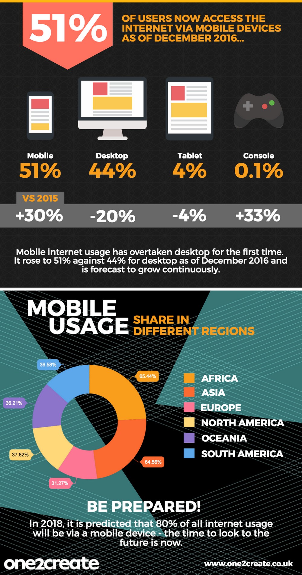
Click to see a list of other RWD resources, and Mobile Usage today.
Consider doing a search on Responsive Design with
Bootstrap and Dreamweaver CC, then select Videos.
Do with your styles, colors, design, and banner.
Students: Add a beautiful customized banner in the <header> element.
Be sure to change colors and styles to your preference, and add your background.
Change the navigation and background image color and design.
The navigation background image is: url(images/navBackground.gif)
Right-click and choose View Source to see code and the internal stylesheet
Also be sure to put the internal styles in a separate external .css file.